SquAire Dog Grooming
UPDATE: Website for Squaire Dog Grooming is up - come visit us!
Thanks everybuddy for your inputs on the logo in my previous post!!! We will need your help again later on in this post where you get to vote for the logo that you like the best! Before that, I would like to tell you a little bit about the name we have chosen.
It is called "Squaire Dog Grooming". Since mum only knows how to groom Airedales or terrier breeds that resemble the general appearance of an Airedale (ie, Wire Fox, Welsh, Lakeland, Irish, etc), our service would only cater to those breeds. We will be offering clipping as well as handstripping. The square dog part signifies "terriers" because most terriers have the square-looking, brick heads.
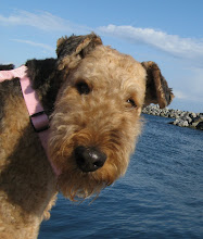
Yes, sometimes we get THIS square,


I was serious when I said mum only knew how to groom Airedales or Airedale lookalikes. Because...... if you were a non-square looking breed, for example, a Golden-doodle, you will not only end up being shaved, but your face will also turn out looking rather square for your breed.... 
This is poor Simba, D-Guy's family non-square dog
Now some of you (excluding hoomans owned by Airedales) must be wondering why the extra "i" in Square making it "Squaire". Well, the simplest explanation is that it is of sentimental value to mum. You see, Miss Sunshade, who just happens to own mum is an Airedale, spelled as "AIRE-dale" and not "AIR-dale" even tho both are pronounced the same.
A few examples below might help you further understand words used in the AireTionary:
- Fresh Aire
- HAirecut
- Aireplane
- RepAire (good one Maggie! Maggie is our matriarch and she knows all the words in the AireTionary)
- Take CAire
So since I was mum's inspiration to learn to groom Airedales herself (STINKY was mum's guinea pig for learning to handstrip), she wanted the grooming name to honour that in some way. Hence you see my head (with dark ears) in the logo previously, as well as the "i" in "Squaire".
Initially, mum and the D-Guy used MY SuperHEAD in place of the "Q" and came up with these logos below,


The critiques were that those might have been too cartoony, hence giving the impression that we weren't serious about our services.
So then mum thought SERIOUS (no problem!), and came up with the following logo,
Many people liked it, but they also said it sent out the message "expensive". As we all know, it is rather hard to change first impressions, and we certainly don't want people to think our service was extravagant. So we have decided against the use of this logo. (Don't worry, this logo hasn't gone to waste. I, the SuperTALENTED Miss Sunshade have allowed my creativity to flourish! You will see them at the end of this post!)
Now friends, this is where you come in. We have made the cartoony one a little more elegant, and the elegant one a little more friendly. Can you vote for the logo that you think is best suited for out little biz? Anyone can vote!! (you can click on the images to biggify)


Thanks for voting!!
Now remember I told you about the logo that was rejected by mum and the D-Guy? Well I made good use of it!
TA-DAHHHHHH......
Of course, to keep things faire (note the spelling), I made one for STINKY too!

Labels:
squaire dog
![]()


13 comments:
We love the Sunshade logo and we think the Stinky logo is just perfect for Jaffa! haha
You and your mum are so clever!
Love ya lots
Maggie and Mitch
LOL Love Stinky's Logo!
Headrubs
Finni xx
Hi Sunshade thanks for clearing up the i thing, I'm not to good at spelling at the best of times!
Anyways I've put me vote in. That up market logo is realy good, I can see where you are coming from, it looking expensive, but if this takes off, you want to use it.
But I have to say it looks great with your names.
See Yea George xxx
WOW - LUV LUV LUV how your did the makeover for Simba - looks MARVELOUS....
We like the more serious logo's - leans more towards terrier people - Willing to pay more for a good AIRECUT because want a groomer who KNOWS how to groom terriers - do not like "BLOOMER BUTT or FUZZY FACE" or the usual SCHNAUZER look - please all Schnauzer buds not meaning to offend but want the AIREDALE look...
Will she also be offering the Oatmeal Blueberry bathes??
We also approve of the Sunshade and Stinky logos - you guys must support Mum with your testimonial and LOTS of pictures.....
XXoooXXoo
Ohhh.. the logos are really awesome!!!
If only i can send Robin to you for grooming. :P
licks to my fave girl
Hi Sunshade
Just a suggestion, maybe Ur mum can print the Name card like the shape of a Bone Shape cookies.
Good Luck to the Side Biz. Elaine
The last 2 Logo of Sunshade & Jafa are really funny.
Cheers
Sharon
We find "d" very well. And we also think that the elegant appearance also attracts more people.
Many make trimming same. Who spends money on it, it wants also very professional is made.
The logo provides the feeling, there work professionals. It is moulder and "in"
A lot of success
We love the Sunshade and Stinky logo's those are totally "bone"ifide awesome. You sure have one talented mum and "D" guy Sunshade. We really liked the serious logo's the best, very professional looking and people are willing to pay top dollar for a great groomer. Too bad your mum didn't groom goldens :)
Totally loved the rejected one that hinted of being expensive. Who cares if someone thinks that?? We are worth any cost, right??!! Glad Sunshade that you at least put it to use! We might even travel the 10hours to come have your mom groom us sometime!! That would be awesome.
Smooches from pooches,
BabyRocketDog
BRD is pipe-dreaming aGaIn!! We voted for D. Good one!!
XX-Hootie
Great design works!
Best of lukhk and stuff!
Hugz&Khysses,
Khyra and Khousin Merdie
PeeEssWoo: Our choice is the leading vote getter at this time!
I like e. and I like a. The only thing about using the cute face as a letter it makes me think of that website pop sugar or one of their sister sites... because i feel like one of them use that cute icon as a letter.
I LOVE the sunshade logo! and the stinky! landshark! too cute!
Wow cool, you're pretty good at grooming and logo designs too. Want to take on a sheltie?
Those were all really nice logos. I voted.
Who wouldn't want a square head?
Slobbers,
Mango
Post a Comment